Lost & Found
A downloadable game for Windows and macOS
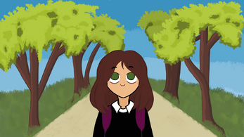
You play as a freshman girl looking to climb the social ladder and become one of the most popular kids in school. While at school, you discover a secret society of students who go around campus completing tasks for others. Joining this club offers you a chance to increase your social points and gain a higher status than before. But it comes at a cost, as the jobs get more and more dangerous will you break under the peer pressure of other students or stand victorious as the most popular person in the whole school? This is the DEMO for our game, enjoy!
Controls:
A / D - Move
E - Interact / Advance Text
Esc - Quit
TAB - View Journal
Options - Continue where you left off.
Google Drive with the music:
https://drive.google.com/drive/folders/1NRTyuTdy79QUazw_-XyxhxdvGF2TS8uX?usp=sha...
| Status | Released |
| Platforms | Windows, macOS |
| Authors | Tonio-tech, Jetinat0r |
| Genre | Visual Novel |
Install instructions
Windows:
1. Download the windows zip file
2. Unzip the file to wherever you so desire
3. Open the folder and locate the file called "Lost & Found" and open it to start playing
4. Your computer may give a warning about the file being unsafe, we're unsure how to fix that but there are ways around it, such as viewing more info and telling it to run anyways.
Mac:
1. Download the mac zip file
2. Unzip the file wherever you so desire
3. Open Mac Build.app
4. If you have a mac and it says you cant open the app, all you have to do is open the terminal, type in "sudo chmod -R 755 " and drag in the app. Then you might have to enter your password. And then click the app again and it should still say that you cant open it, so go to the General in Security and Privacy and say "open anyway". This will (hopefully) work with all apps that have this problem!


Comments
Log in with itch.io to leave a comment.
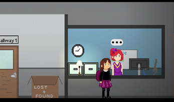
The environment and ability to immerse the player are really good. Gameplay is simple, and it could be definitely extended fully into a complete experience.
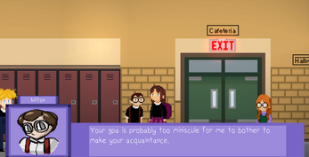
I think more attention should be put into some of the smaller artistic details to make it more consistent. The Purple box UI does not mesh well with the character art -- it would be probably better if there was some paper texture/fuzzy borders etc. to fit the art style
The pixels are unaligned periodically. Is there a way to fix this?
And most of all, the cutscene art is a little cringey and needs a lot of polish. It probably would be OK to use one fleshed out image and just a lot of text rather than needing to animate individual frames (sort of like Danganronpa cutscenes)